Chanel’s New Look
When one thinks of Chanel, they automatically imagine black, white, and gold. For the first time, designer Karl Lagerfield designed a collection without using black or navy. The result is gorgeous. It actually makes sense if you think about it. Spring 2010 is mostly pastels and light colors that look sweet and delectable. Black doesn’t really fit into this picture. Black reminds me of licorice, which is nasty, nor truly sweet.
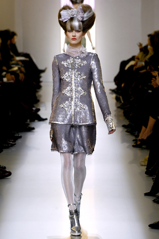
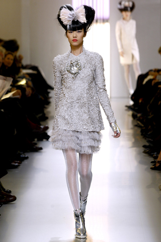
One thing to notice is the whole look overall. It’s kind of a sweet theme with hair in heart-shaped buns and silver shoes. Also notice the Lolita bow….bows are in at the moment.
I love the stockings. In some pictures it looks as if her legs are filled with liquid, or she’s put her legs in a silvery-translucent tube.
The two biggest statements of the show were texture and jewelry. Let’s start with texture. To make a long story short, there was lots of it. I didn’t really see a connection between each but it still looks yummy.
This one really gets me because I have no idea how it fits into the collection. First, it’s green, and the texture does not apper anywhere else.
I really like this one because of the color and how it’s lightly layered like a pyramid. 
Now this one reminds me of the 2010 RTW collection. 
I love this top, but I’m not sure how the bottom corresponds to it. It looks like it should be two separate pieces. 
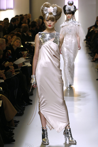
Jewelry comes in second. What’s there to notice is the incorporation of it into the looks, and most function less as jewelry but as straps, and other uses that would have looked boring if made just with fabric.
This one is amazing because of how the jewelry makes the top stay up on her body. Very innovative. 
One thing I saw that made me think was this dress:
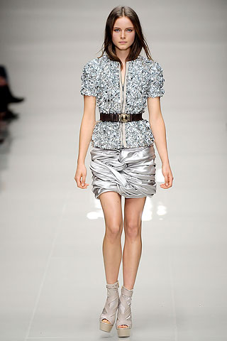
 It looks a lot like this one from Burberry Prorsum Spring 2010 RTW:
 Burberry’s collection played heavily on this idea of a “scrunched” and “tied” dress and skirts. I just thought it interesting how Lagerfield took this idea and made it into his own (sort of). It’s also interesting how the colors and kind of satin finish are characteristics of both shows.
Lastly, I just want to leave you with one last image, the closer of the show:
 Wedding anyone? If I get married, (and it was to a woman), I would most definitely have to wear this. Who cares if we spend the honeymoon funds on these outfits (as well as our life savings). They’re so fierce. I actually tried on a lower-quality version of this suit in silver from Topman, which was 400.00. I felt like I could catch on fire at any moment. The fabric was so bad. This picture really just makes me want to try this on!!!!


